The first few months of 2021 have been marked by many promising partnerships and success stories. As you know, we attach great importance to customer satisfaction and are proud of the trust you place in us every day. In order to continue to respond to your needs, we are pursuing our development and growing our teams. The time has come to develop our brand so that it reflects our current identity and allows us to communicate our ambitions through it. A lot of workshops, passionate discussions and brainstorming were necessary to reach the result we are unveiling today.
Logo, colours, typography, brand values and guiding principles – we’ve rethought everything to make Foyer Global Health an insurer that is in tune with time.
This long-term project was carried out entirely in-house, thanks to the unfailing involvement of all our employees. We are pleased and moved to have collectively laid this first milestone, heralding many new developments that will directly benefit all our clients, partners and brokers.
The context and decision for a new brand identity
Founded in 2014, Foyer Global Health offered its international health insurance solutions through its network of brokers and agents for its first 4 years.
2018 was a turning point for the company, which then expanded its scope and went online. Direct sales of health coverage to individuals were offered through a 100% online subscription path. This was designed to allow expatriates around the world to insure their health, wherever they are. Our online application process has also been completely redesigned to further simplify the process of purchasing international health insurance.
Over the past two years, many additional products and services have been developed to meet the growing need for international mobility. We are, more than ever, convinced of the relevance of an offer different from those of the insurance behemoths. We are the challenger that is shaking up the sector and bringing more proximity and product innovation.
This ambition is taking shape today with the 360° redesign of our brand. Rather than simply revising our graphic charter, we felt it was important to question and renew ourselves in order to anticipate new societal issues as well as those specific to health insurance. Our goal is to offer increasingly digital, accessible and flexible solutions. Especially since this year marks the 7th anniversary of Foyer Global Health, the age of reason. This is undoubtedly the most opportune moment to break new ground and give our best!
Definition of our corporate values and the concept of the new logo
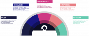
The starting point was the values of the Foyer Group (Trust, Excellence, Innovation, Integrity and Independence) that we have made our own. We wanted to emphasize our skills, both in terms of expertise and efficiency, but we also wanted to add the notions of trust and accessibility, both in our role as insurer and employer. Each client, partner, or employee has the same degree of importance in our eyes and deserves our undivided attention.
Our team of graphic designers used these values to design a new logo whose attributes are:
- Our brand name and that of the Foyer Group
- The thoughtfulness and benevolence that characterize the health sector


Thus, the choice was naturally made for a rounder and therefore less rigid design than the old logo. The icon integrated into the word “global” represents a fusion between the heart and the world, further emphasizing the international dimension of our brand.
In short, with this logo we are affirming ourselves as an insurance company with a global reach and ever closer to its various stakeholders.
How the typography and colours were chosen
Modern with its clean lines, reassuring with the roundness of the letters and professional, Barlow is the ideal typeface to represent the message carried by Foyer Global Health.
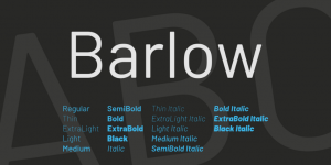
Typography: Barlow. Created by Jeremy Tribby. Source : Freefonts.io
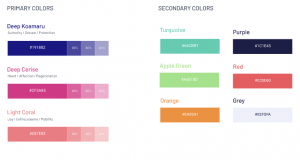
We wanted to keep the founding colours of Foyer Global Health (blue and pink), while making them evolve in a more harmonious way. New, more dynamic and vibrant colours were chosen to enrich the complementary colour palette. We are convinced that they will have a positive impact on the visual communication of the brand, allowing us to differentiate ourselves and to be perfectly in tune with the times.
Always there for you: our slogan and brand tone
Until very recently, we didn’t have a phrase that summed up our brand DNA and that was very frustrating. During a workshop, two employees came up with a concise slogan that encapsulates all our values:
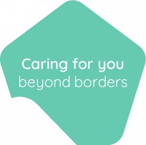
Customizable to your liking, this slogan conveys the core message of Foyer Global Health: “Wherever you are in the world, we are always there for you!”
We will continue to uphold this commitment to all our customers, partners and suppliers. Transparency and respect are cardinal values and we will do everything in our power to live up to your expectations and make our exchanges always valuable and enriching.
We hope that our new brand identity will seduce you as much as the pleasure we had to create it. We look forward to your feedback and comments. This is a new phase for Foyer Global Health. We’ll be sure to share it with you, and it’s a precursor to many others that we’ll be sharing with you in the months to come. You have not heard the last of us!
Your Foyer Global Health Team


